OmniMoney chatbot
Redesign of AI chatbot for OmniMoney by Boost Mobile.

OVERVIEW
SUMMARY
OmniMoney by Boost Mobile was redesigning and upgrading the chatbot within a tight timeline.
CHALLENGE
The upgraded chatbot was near it's final stages but the design of that chatbot version was outdated in design and lacking an enjoyable, intuitive experience. The hamburger menu that solely contained a language selector was confusing, as well as the changing button that shifted between a send and back button further increased confusion and crated a frustrating experience.
SOLUTION
As the Lead Designer, I redesigned the chatbot within the timeline, focusing on the most important elements.
ROLE
Lead Designer - Sr. Product Designer
DESIGN TOOL
Figma
01DISCOVERY
01.01 BEFORE
ORIGINAL STATE:
We started off by discussing the expectations, requirements, and the then-current state with the team to ensure we were all on the same page.
With this, I went through the original live state of the chatbot, as well as the testing state that required further refinement.


01.02 COMPETITIVE ANALYSIS


I researched a variety of chatbot designs that have a superb user experience, that reflect the needs of OmniMoney such as a modern user experience, with web3 design.
Ultimately, I followed most inspiration from chatbot design from Origin, as it had a very intuitive and interactive user experience.
02DEFINE
DESIGN SOLUTIONS & DIRECTION
With the competitive analysis in place, I had a clearer design direction to move forward with. This included:
-
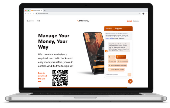
Light design to increase user trust and better match a more professional banking experience.
-
Swapping the hamburger menu for a language toggle button to decrease confusion on expected behavior.
-
Interactive buttons with a consistent color scheme.
-
Implementing a chat avatar image that is more personable.
-
Colors that are on par with the brand, yet also create a more uplifting experience, especially considering users may already be frustrated trying to find answers.
-
Incorporating Miller's Law of UX Laws to decrease the amount of options to choose from, to decrease cognitive load and not overwhelm users.
-
Upkeeping and improving conversational language for a more natural and human experience
-
Decreasing the long initial introductory Terms & Conditions text.
03DESIGN
FINAL DESIGNS
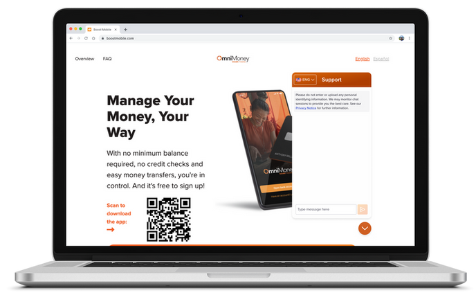
With the design direction and solutions in place, I moved forward with redesigning the chatbot.
PROTOTYPE
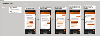
After the High-fidelity designs were complete, I added interactions for the prototype.
Here you can view both the final prototypes:
04HANDOFF
DEV HANDOFF
To ensure clear communication and expectations of designs, besides meeting with the team to go over the final designs, prototypes, and expected behavior, I also went over my created dev annotations. This included the following:
-
Measurements of all elements and between elements on the page
-
Typography, color, and effects details
-
Expected interaction behaviors
-
The destination to all links
-
Google Sheet with a list of the elements to update that had been missed


05REFLECTION
REFLECTION & NEXT STEPS
The project had a tight timeline of approximately 2 weeks. This required organization, planning, and honing in on the most important factors for the redesign.
The following steps on the chatbot redesign would include:
-
Measure the success rate of chatbot by integrating a rating scale and optional comment field after each user interaction. The measurements for success would include how intuitive it is to use, clarity of responses, effect of chatbot language, providing desired options as needed, and above all, seeing if users are getting the answers they need in a way that makes the most sense to them.
-
Ideating solutions based on research results and redesigning the chatbot accordingly.
E-commerce landing page redesign


