Crysteous
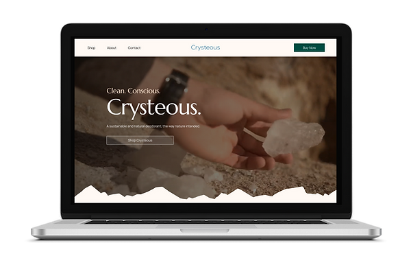
Ecommerce website for luxurious natural deodorant

CRYSTEOUS OVERVIEW
SUMMARY
Deodorants are so regularly used, yet they are either filled with toxic chemicals or they don't work as intended. Crysteous seeks to revolutionize the deodorant industry by going back to the roots - 3 generations prior - and offering a simple yet effective, zero-waste, luxurious all-natural solution: Crysteous; the powdered crystal deodorant, the way nature intended.
CHALLENGE
Crysteous had a prior website that they decided to take down as it wasn't getting enough traction and it wasn't aligned to their product. They were seeking a memorable, luxurious, nature-focused website that reflects their product, brand, and audience.
DURATION
6 weeks
ROLE
UX/UI Designer in team of 5
TOOLS
Figma, FigJam, Photoshop, Procreate
SOLUTION
The design team and I worked on creating a luxurious and memorable design that has a focus on nature to best reflect the product and brand, as well as to both attract and retain users.
PROCESS
01DISCOVERY
01.01 TEAM KICKOFF
To begin our project in a collaborative, organized, and efficient manner, as a team, we held a Zoom meeting to review everything. This included the client's intake interview, the Project Plan, going over deadlines, responsibilities to be met, and all other details regarding Crysteous.
01.02 CLIENT QUESTIONS
After we'd gone over the information, we had some questions for the client. We wanted to ensure having a full understanding of the product, the client's needs and expectations. We created an additional document to get the clarity that we needed on product, brand, and audience details, as well as design expectations.
Given my background and interest in holistic products, I had plenty of questions about it for the client so that we could highlight the key features of the product and create the memorable website design that Crysteous needs.
01.03 CONTENT EVALUATION
To gain the most understanding on the product and brand, we researched Crysteous and evaluated our findings.
Overall, the client was on a variety of platforms to ensure maximum audience reach. Although the design content that we found made sense, we understood the client's desire for a cleaner and more luxurious approach that would still meet their natural design.
02IDEATION
02.01 USER STORIES
The client provided us with 5 user stories for the the redesign. Each team member selected a user story to work on. I worked on User Flow #1: "As a user, I want to see how the product works."
02.02 USER FLOWS
We each created a user flow for our user stories, for a total of 5 user flows. I worked on user flow #1, "As a user, I want to see how the product works."
This helped me understand how a user would navigate the website for to reach what they need and to account for every step and screen. I focused on the simplest, most straightforward and intuitive way for the user to achieve the task.
Homepage:
02.02 LOW-FIDELITY WIREFRAMES
Next, we worked on LoFi wireframes. When creating the Homepage, I prioritized a clean, aesthetically-pleasing design with a natural flow that brings the content to the user's attention in an inconspicuous and elegant manner. I created the mountains design for the page to bring in the natural aspect that the client desired in a luxurious manner. I ensured to create pixel-perfect wireframes following the 8pt grid. I iterated this several times until I was satisfied with the result.
I also assisted my teammate with the Contact page for a clean, minimalist, luxurious contact form and blurred background behind the modal for a more elegant option instead of a color overlay.
03DESIGN
03.01 UI INSPIRATIONS

-
All websites do a superb job at achieving the "web3 look" with the dark background (Polygon with white) and bright colors.
-
A significant amount of soft gradients and glassmorphism is seen with these designs.
-
Generous spacing is used given that black is much more restricting than white (which creates openness). This way, the user doesn't feel overwhelmed and the page can still achieve a clean, modern, and polished look.
-
Plenty of captivating imagery is used to keep the user immersed in the website.
03.01 UI INSPIRATIONS
#1 Product-focused


#2 Bold & luxurious

#3 (Mainly) clean & relatable

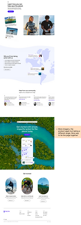
The client wanted to achieve a clean, luxurious design that focused on nature. In order to have the best understanding of what users were expecting for the UI and meeting the clients' goals, I researched other natural product websites and clean, luxurious websites as inspiration for the redesign.
-
All websites featured a white background
-
The first website wasn't very luxurious but it was clean and had some elegant features achieved with the arched frames and the amount of whitespace. It also did a superb job at showcasing the product and bringing it to the forefront
-
The second website featured a luxurious feel from the use of light and shadows, along with clever imagery that flows with the page itself
-
The third website was mainly clean, with the exception of the cluttered hero. It had plenty of whitespace, and was more relatable towards the user with the signature, imagery, etc.. Most notably, the footer used mountains as a way to implement nature in a simple yet elegant manner
03.02 UI ITERATIONS
To provide options for the client to select from, each team member worked on a UI iteration of the Homepage. We created 2 versions; one with an image in hero and the other with a video as the background.
03.02.01 FIRST ROUND
I created two UI iterations. Both with a minimalist, clean, luxurious yet approachable design:
-
White primary color to create bright, clean, breathable feel
-
Warm, neutral secondary color to bring the earth tones of the mountains in a luxurious manner
-
Teal for CTAs. Complimented the warm tones and white. Lighter teal in the footer to tie it all together
-
Outline icons for minimalist and delicate yet open and approachable design
-
Fonts:
-
Clean, open, minimalist Sans Serif that reflected the wordmark of Crysteous. Approachable yet luxurious; showing high-end feel while also being creating trust within the user
-
Italicized Serif text that created a more traditional, high-end feel that created a nice balance in the overall UI flow
-
As pictured in the video, I also envisioned the navigation having a scroll animation:
-
Clear navigation fill while on the Hero with a slight background blur for elegant readability while maintaining the transparency
-
When scrolling off the Hero, the fill was mostly white with slight transparency and background blur, and a dropshadow so the navigation seemed slightly raised from the page
03.02.02 FINAL ITERATIONS
The client then informed us of their desire to feature the snippets of their video in the hero instead of posted onto the page itself. To achieve this, I changed the hero background to a screenshot of the video. I also included use of shadows to create further depth and a more luxurious feel.
03.03 STYLE GUIDE
We created the Style Guide to maintain consistency and organization throughout the project. We ensured to use colors, typography, logos, and all other design elements to best compliment the product and the audience for Crysteous.
03.03 HIGH-FIDELITY WIREFRAMES
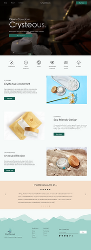
We then created the HiFi wireframes from the MidFi wireframes, based on the UI iterations that the client chose. We ensured to create a consistent design for a seamless experience. We each worked on the page that was in accordance to the assigned user flow. Given that I worked on the first user flow, I worked on designing the Homepage.
04DELIVER
04.01 FINAL SCREENS
With the screen designs seamlessly flowing together and with the client's approval, we then had the final screens :
04.02 CLIENT HANDOFF


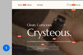
To ensure that the client could properly develop the new designs, we annotated the screens. For this, each element within the pages was measured and noted, along with any information that was useful for the developers to keep in mind.
05REFLECT
FINAL THOUGHTS & LESSONS LEARNED
By working on Crysteous, I expanded my horizons by exploring differing typography and learned more about the varying uses of typefaces and what that can illicit within the user. I also explored drastically different font sizes for a bolder, more memorable experience. I enjoyed that I was able to use graphic design skills to create the mountains for the homepage and footer, for a minimalist way of incorporating the touch of nature that the client was seeking.
Overall, with Crysteous I was able to explore different ways of approaching UI design to create a beautiful, elegant, and memorable experience for the user, without diminishing a minimalist design and maintaining a luxurious feel. I was able to work with a great team that was collaborative and also created a fun, enjoyable team dynamic. I believe this enjoyment and teamwork helped us in creating a more seamless, pleasing, and user-friendly design.


