Achieve
All-in-one mobile app that assists users in achieving their goals

ACHIEVE OVERVIEW
SUMMARY
A common issue amongst people is dissatisfaction within their lives or themselves. Unfortunately, most people struggle with making needed changes and sometimes even knowing how to go about it. I designed an all-in one mobile app to assist users in creating the changes they need.
CHALLENGE
Goals are a common driving force amongst people, yet they have become a disappointing and overwhelming process. This is because many people don't know how to set goals and those that do, struggle with achieving them. It can be difficult to know where to even begin with creating the life one wants and it can be even harder to make the necessary everyday changes to make it happen.
DURATION
14 weeks
ROLE
Sole UX/UI Designer
SOLUTION
I designed a mobile app that assists people in creating and achieving their goals. The app addresses the main setbacks and provides the most sought-out necessities for goal achievement, including:
-
Discipline, organization, and time management: current goals & habits, Calendar, & customizable to-do list
-
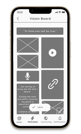
Maintaining motivation: Motivation Board
-
Guidance, developing helpful habits: quizzes & personalized resources
-
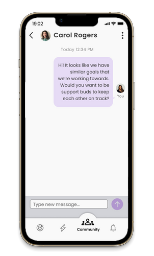
Support, accountability, teamwork: Support network & Events
-
Incentive to complete goals: Achievement Amount (monetary incentive)
TOOLS
Figma
Photoshop
Miro
Invision
Procreate
01DISCOVERY
01.01 SECONDARY RESEARCH
OBJECTIVE
To understand why people struggle with achieving goals, I focused primarily on reliable data from studies. After this, I turned to articles to understand the perspectives from more people and companies in a more conversational approach.
FINDINGS
Overall, the noted factors for not achieving goals are:
-
having a fixed / win-or-lose mindset
-
goals that are rooted in achieving in comparison to others
-
improper planning
-
focusing on the surface-level of goals
-
lack of confidence
-
self-sabotage
-
doing it alone, without a support system
of people set goals or themselves and actually achieve them
JUST
6%
of the global population struggling and/or suffering now and see it to remain this way for the next 5 years
73%
DESPITE
“Scientists measured the electrical activity from the brain as students confronted an error..in the fixed-mindset students there's hardly any activity…in study after study, they have run from difficulty…They don't engage with it….with the growth mindset, the idea that abilities can be developed…They engage deeply, they process the error, they learn from it and they correct it.”
---Stanford's world-leading mindset researcher & psychologist Carol Dweck, during her TED Talk, The Power of Believing That You Can Improve
This revealed the impact and importance that one's mindset has on perseverance, discipline, and therefore goal achievement.
01.01.02 COMPETITIVE ANALYSIS
OBJECTIVE
To understand what is currently available and how Achieve might compare, I researched mobile apps for goals. I made a list of the features (pros), and cons of each. In my research the top apps I found were Habit, Strides, Perfectly Happy, and Productive:

Habit Tracker
-
For creating and maintaining habits
-
Calendar-focused, to-do lists
-
Feature to add friends
-
Feature: in-depth progress and progress report (Premium/paid)
-
Built-in monthly calendar with personal stats
-
Easy-to-read progress charts by habit
-
Quick tutorials to guide user
-
Minimalist, clean, sleek UI, with pop of color: white and reddish-pink
-
Playful yet sleek UI
Cons:
-
No motivational assistance

Strides
-
Calendar and habit-focused (called "tracker" in app)
-
To-do list
-
Kept track of progress
-
Feature: reports of progress, trends, calendar & rankings (premium/paid)
-
Minimalist and plain UI: dark blue and white
-
Straightforward, serious, and plain UI
Cons:
-
UI was plain; created a cold, impersonalized experience
-
Did not provide additional features besides to-do list, tracker & reports on this.

Perfectly Happy
-
Vision board, journal prompts & affirmation to create more joy for the user
-
Each vision board is a video of chosen photos, affirmations, music, etc.
-
Affirmations section (shows varying affirmations, audio, can share, etc.)
-
Gratitude Journal and Mood Journal
-
Plenty of how-tos and guidance
-
Able to make vision board into widget on phone
-
Motivating, brightening UI: white and yellow
Cons:
-
UI was not accessible; difficult to read and see due to yellow on white
-
Vision board was viewable as video only
-
Can add vision board if paid or during free trial only
-
UI could improve, be more up-to-date and sleek

Productive
-
Onboarding quiz to meet user's needs/personalize experience
-
Focused on building habits
-
Calendar / to-do list
-
Real-time challenges for helpful habits (some were paid)
-
Stats/progress (detailed stats paid)
-
Articles on some helpful habits
-
Dark, playful UI
Cons:
-
Ads every few minutes that last a while on free version; to exit ad, a popup for App Store comes up
-
Lacked support, human connection
CONCLUSION
All apps were geared towards users that are seeking to make changes in their lives. Although most did so by building habits, none included the option of having a long-term goal. In conjunction, these apps offer support, organization and management tools, progress reports and stats, and motivation. However, none of the apps provide all of these features on one platform.
01.02 PRIMARY RESEARCH
OBJECTIVE
I wanted to hear directly from potential users so I focused on user interviews. I created a research plan, then conducted screener surveys, user interviews, and finally, synthesized the findings into an affinity map, empathy maps, user personas, and How Might We statements. This allowed me to deeply understand users' processes and pain points in goal achievement.
01.02.01 SCREENER SURVEYS
For a simple yet direct way to reach potential candidates I created a user survey on Google Forms. This was distributed through social media, sent to members of my physical and virtual communities.
I chose participants that were:
-
Interested in achieving goals (and creating goals, if applicable)
-
Experiencing difficulty in achieving and/or creating goals
-
Willing to follow instructions and stick to a routine
-
Interested in improving/shifting their mindset and situation in order to achieve their goals


01.02.02 CONDUCTING THE RESEARCH
After I had chosen the 5 participants, the remote interviews were conducted via Zoom where I asked participants thorough questions in order to truly understand the process of goal attainment and setbacks.


The major findings from the interviews included:
-
Having a guide and/or a buddy to work on goals with is extremely helpful
-
Most dropped goals were due to a lack of support and an inability to maintain momentum / motivation.
-
"Musts" for achieving goals include organization, time management, as well as consistency and discipline.
-
Ensuring self-care, giving oneself needed breaks was helpful to keep momentum (in balance with discipline and consistency)
-
Other helpful behaviors include self-confidence and a positive mindset
-
Some prefer doing research (videos, articles, asking others) prior to setting goals, ensuring goal is realistic
01.03 SYNTHESIZE
01.03.01 AFFINITY MAP
I then organized topics and statements from user interviews onto sticky notes. I grouped 150+ sticky notes into a total of 5 groups in accordance to main topics that were mentioned.
The notable topics being:
-
Participants' experiences, feelings and thoughts towards goals overall
-
Tools used when working towards goals
-
The participants' process when setting and working towards their goals
-
Pain points in goal achievement
-
What participants have found to be helpful when striving towards their goals

01.03.02 EMPATHY MAPS
I then created empathy maps to better grasp the inner and emotional experiences of the participants. I narrowed everything to 2 empathy maps due to similarly-found/repetitive responses: The Goal-Getter and The Strategic:


01.03.03 USER PERSONAS
To better connect with and humanize the findings, I created user personas based on the affinity maps and empathy maps. I made 1 user persona per empathy map and came up with Fiona and Alex:


01.03.04 HOW MIGHT WE...?
Based off my research, the pain points are:
-
Lack of clarity; not knowing where to start, not knowing what steps to take
-
Inconsistency; Losing momentum, burning out
-
Time management, organization
-
Support from others, motivation, doing it alone
-
Becoming sidetracked, habits that don’t support goal, temptations
I then came up with the following How Might We's:
-
How might we guide the user through the goal creation and attainment processes?
-
How might we assist users in honing discipline and maintaining momentum throughout their goal attainment process?
-
How might we assist users in remaining on track with their goals in an organized, efficient, and motivating manner?
-
How might we provide users the support they need in order to achieve their goals?
-
How might we prepare users to remain on track with their goals when and if issues or distractions arise?
02IDEATION
02.01 BRAINSTORM
To begin the ideation stage, I set aside 30 minutes to brainstorm and sketch ideas pertaining to each HMW statement. This was a great way to allow potential solutions to come to mind.


02.02 USER STORIES
In order to design the necessary features for the app, I wrote user statements to properly focus on these features. The user stories were written in order of priority - must haves, nice to haves, and okay not to haves.
As a user, I want to...(so that...)

02.03 CARD SORTING

Due to the amount of features in mind, I wanted to ensure best placement within the app. I recruited 6 participants online and from my local community to conduct remote card sorting testing using UX Tweak platform. The results varied but gave me better insight for placement.
02.04 SITEMAP
I sketched out the sitemap based on user stories, then I digitized it in Figma. This helped me to really hone into the structural aspects of the app. I wanted to create a seamless app that can accommodate all of the necessary features.

02.05 USER FLOWS
I created the user flows in terms of Screen, Action, or Decision. This helped me understand how a user would navigate the app and to account for every step and screen. I focused on the simplest, most straightforward way for the user to achieve the task.
Key:

Add a new goal:
Send a new message to another user via a post:
Add a new photo from device to "My Why's":
02.06 SKETCHING
I sketched wireframes by hand based on the user flows and sitemap. This was iterated several times, until I was happy with the results and went over it digitally:

02.07 LOW-FIDELITY WIREFRAMES
I created LoFi wireframes based on the sketched wireframes. I prioritized creating simple, clean designs that would allow the users to easily access the needs that were mentioned during the interviews and my findings. I iterated this several times until I was satisfied with the result.
03DESIGN
03.01 MOOD BOARD
I created a moodboard to visually showcase inspiration for the app. I focused on a clean, open aesthetic that is also motivating for the user.

03.02 STYLE GUIDE
.png)
I tried and tested various designs, ensured everything met accessibility standards. I focused on a cohesive design that creates a motivational, focused, yet also calm psychological effect with the help of color psychology and easy-to-read typefaces.
03.03 HIGH-FIDELITY WIREFRAMES
I created High-fidelity screens from the previous screens. I added gradients for creating a sense of playfulness yet calm, colors were chosen with psychological effects in mind, in accordance to the topic.
04TEST
04.01 PROTOTYPE
I created a prototype from the High-fidelity screens so that I could better understand the user's navigational experience. All of the user flows were placed into one prototype, the screens seamlessly flowing to one another.
04.02 USABILITY TESTING
04.02.01 CONDUCTING THE TEST
I created a usability test plan to remain organized with the test focus and with my findings. I then reached out online and to my local community to find 5 participants that were interested in achieving goals and use mobile apps.
Once I had the 5 people, I conducted the 30 mins - 1 hr moderated usability testing sessions on both light and dark prototypes:
-
3 conducted remotely via Zoom
-
2 conducted in-person
I wanted to understand how users navigate the app, impressions of the screens, experience with the flow and to uncover any usability problems throughout the red routes. I wanted to learn how it could be improved for the best user experience.
To do this, I gave the participants 3 tasks centered on:
-
Adding a new goal
-
Messaging another user
-
Uploading photo to Motivation Board
04.02.02 SYNTHESIZE
I typed the main points from the testing onto post-its to remain organized with the findings.
Testing revealed:
-
navigational issues due to a lack of consistency with the app's UI and lengthiness in the forms.
-
Participants found the overall prototype to be aesthetically pleasing and motivating
-
They enjoyed the features found within the app and greatly appreciated the personalization, the tips and explanations provided.
Opening:
Test 1:
Test 2:
Participants:


Test 3:

04.03 REDESIGN
04.03.01 DEFINE

I created a chart with the pain points and according solutions in order of critical to normal, from the findings in the case study results. This helps determine the needed changes for the design.
04.03.02 MAKING THE CHANGES
I then made over 21 changes including these 3 critical issues:
1. Unclear navigation
Issue
Users were confused with where to go in the app and where features can be found. They recommended that I create a tutorial at the start of the app.
Solution
I created a navigational tutorial during the initial app startup that quickly guides the user, describes what can be found in each section, and where to access this tutorial for future reference.


2. Confusing UI
Issue
“It's too cluttered; like several, separate apps jammed into one - it didn’t make sense.”
Choppy/non-flowing app UI; the main navigation pages don't match the rest of the app.
Solution
I changed the app’s UI so that it is easier to navigate with a more minimal approach. I simplified and took out the main navigation pages, allowing the user to go directly into the content.


3. Form is too long
Issue
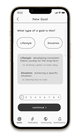
The form for creating a new goal is too long, cumbersome, and unmotivating; difficult to navigate.
“ I don’t want to spend 20 minutes just to create one goal; there are too many steps.”


Solution
I recreated the form by placing it all onto one screen. I changed the layout of the buttons, added the option for users to select days to work on their goals.

04.04 FINAL RESULTS
Original prototype
Redesigned prototype
05REFLECT
FINAL THOUGHTS
Through the creation of Achieve I learned the importance of maintaining balance in my designs and the importance of simplicity in UI. A variety of features called for a simpler design to create a more seamless app.
This project showed me the hinderances of perfectionism; it was easy to get lost in the excitement of continually adding new features to try and create a perfect app. So In the future, I'll ensure to always keep the big picture in mind.
Given this, I’ll be sure to check in more frequently with how it’s all tying together, the projection, and how the current progress might affect and be experienced as a user. If I would have kept this all in mind, I believe that the time and amount of design iterations would have substantially decreased and more time could have been spent on usability testing.


